27 Statistics and Excel: Evaluating Normality
Jenna Lehmann
Evaluating Normalcy
Many statistical tests run on the assumption that the data with which you are working is normally distributed, so it’s important to check. There are several different ways to go about this. This post will explain a few different methods for testing normalcy as well as provide some instructions about how to run these tests in Excel.
Mean vs. Median
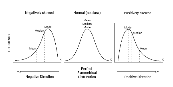
An important rule to note about distribution is that in a normal distribution, the mean, median, and mode are approximately equal. What it looks like visually is that the mean, median, and mode are all sitting at the top of the hump of the bell curve. When a distribution is skewed, these values become different. The mode will always sit around the hump of a distribution (because this is where most of the values have accumulated). The mean is the measure of central tendency most affected by extreme variables and outliers, so it will follow the longest tail. The median, in this case, will always fall somewhere between the median and the mode. Put another way, if the distribution is positively skewed, the mean will be the greatest value, the median will be the second greatest value, and the mode will be the smallest value. If the distribution is negatively skewed, the mean will be the smallest value, the median will be the second smallest value, and the mode will be the greatest value. So when you’re looking at a data set, you may be able to get an idea of the skew of the distribution by comparing the mean and the median.
The easiest way to get all of the descriptive statistics you need in Excel is to download Analysis ToolPak. To do this go to: File>Options>Add-ins>Analysis ToolPak. Make sure to then hit GO in the bottom right, and then click the check-mark next to Analysis ToolPak before hitting OK. These directions are good for PC, but Mac users may need to find a different route for including Add-ins.
Once there, go to Data>Data Analysis. From there, you should see this pop-up.
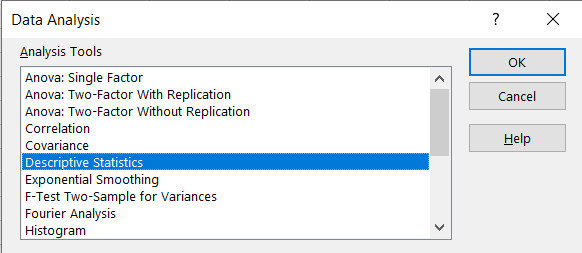
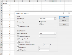
From there, click Descriptive Statistics, select your input range, select an output range, click Summary Statistics, and then click OK.
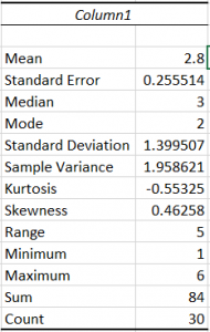
Your output should look something like this. You should be able to see the mean, standard deviation, median, mode, range, minimum, maximum, etc. These will all be helpful in future normalcy tests.
Range and Interquartile Range vs Standard Deviation
Another two questions which should be asked when comparing mean and median are, “Is the range approximately six times the standard deviation?” and “Is the interquartile range approximately 1.33 times the standard deviation?” Given the descriptive statistics we just ran, the first question should be easy to answer. Simply multiply the standard deviation by 6 and check to see if it is close to the range. Interquartile range is the difference between the first quartile and the third quartile, which are not given to you when you run the descriptive statistics. One way to find the first and third quartiles is by using the =QUARTILE function. When using this function, highlight the data, punch in a coma, and then put in the number quartile that you are interested in (1 or 3). It should look like this: =QUARTILE(A2:A:20,1). Find the difference between the two and compare this to the standard deviation multiplied by 1.33. If either of these results show wildly different results than expected, you should consider that the data may be skewed.
Boxplot
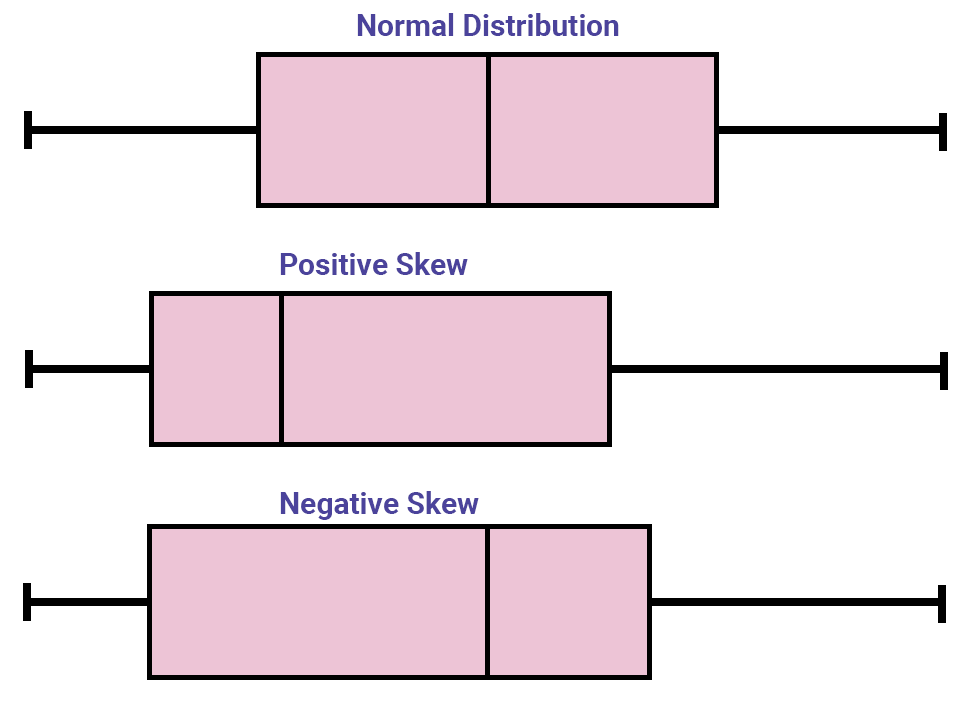
A boxplot is a quick way to see if the data you’re working with are symmetrical. To create a boxplot in Excel, highlight your data and go to Insert >Recommended Charts > All Charts > Box & Whisker. If the plot looks to be symmetrical, your data are likely normal. If one of your box sides or whiskers stretch out farther than the rest, your data may be skewed. More specifically, if your whisker extends out in the direction of the larger numbers, your data are positively skewed. If your whisker extends out to the smaller numbers, your data are negatively skewed. Below is an example of each.
Histogram
Histograms are a good way to visually check the normalcy of large amounts of data. When evaluating it, the shape of the bars should represent a bell-curve. If not, then the data may be skewed or multimodal. To create a histogram, highlight your data and go to Insert > Recommended Charts > All Charts >Histogram. When you first create the histogram, it may look a little wonky. To fix this, click the new chart, and a green plus sign should appear. Click this, hover over Axes, and move your cursor to the right until a black arrow appears. Click this, then click More Axis Options, and a bar should appear on the right side of your screen which will allow you to adjust your bin width and bin number.

Empirical Rule
Although there is no simple way to use the empirical rule to test to see if your data are normally distributed, if you did want to take that route, the rules are as follows:
- Two-thirds of the data lie within ±1 standard deviations of the mean
- Four-fifths of the data lie within ±1.28 standard deviations of the mean
- 19 of every 20 data points lie within ± 2 standard deviations of the mean
If one were to do this in Excel, one might create a frequency distribution with these standard deviations as the bins and compare those frequencies with these rules. This can be done using the Histogram feature of Data Analysis.
Normal Probability Plot (Q-Q Plot)
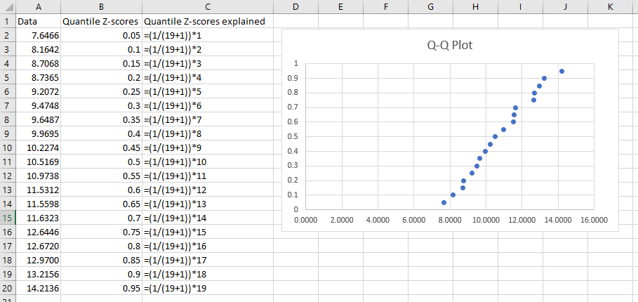
A normal probability plot (otherwise known as a quantile-quantile or Q-Q plot) is a way to visualize data normalcy. Steps on how to create one in Excel are as follows:
- Step 1: Order the data from least to greatest
- Step 2: Find the expected quantile z-scores. This is done using the following equation:
 where
where  is the number of data points and
  is the ordered value. The smallest number would have an ordered value of 1, the second smallest would have an ordered value of 2, and so on and so forth.
 - Step 3: Finally, you can highlight the data and the z-scores (make sure the two columns are next to each other), go to Insert, and create a scatterplot with the data. If the line is straight, then the data is normally distributed. If the line curves upward, the data is positively skewed. If the line curves downward, the data is negatively skewed.
This chapter was originally posted to the Math Support Center blog at the University of Baltimore on February 4, 2020.
