Lab 3 – Demo Data
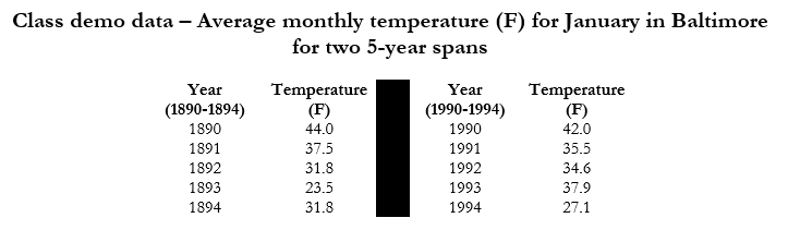
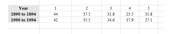
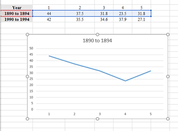
1). Start with entering this sample data into Excel. Open a blank workbook, and create a table with your two time series. Even though we are looking at change through time, the gaps between the two data series are so large that our graph would look very strange. Instead, because both of our time series have the same number of data points, we are going to graph them side-by-side. Note that when entering the year ranges, write “year to year” instead of “year-year” – this is because Excel interprets the dash as a minus sign and gets confused. It should look like this.
First, let us determine some summary statistics of our demo data. Click in an empty cell, type “=AVERAGE” and then use your mouse to select the data values for the 1890 to 1894 data series. Add the close parentheses, and hit “Enter” on your keyboard. Excel should automatically calculate the average for you. If something goes wrong, you will see “ERROR”, and you should double-click on the cell and make sure that you have selected the correct cells, and that the parentheses are closed.
2). Repeat this process for the mean, median, mode, maximum value, minimum value, range, standard deviation, and standard error (see earlier in the lab for those functions).
Now let’s graph the data. When graphing multiple data series on top of each other, it is easiest to graph the first one, and add the second later.
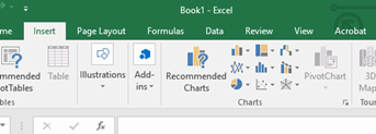
3). Highlight the 1890 to 1894 row only, and at the top of the page, select the Insert tab, and then the zig-zag lines in the Charts section that let you select a 2D line graph. Select the first 2D line graph.
4). Once you select your graph, it will look like the picture below. Ignore the fact that the title is incorrect for now.
5). To add our second data series, right click inside the graph and select “Select Data Source”. A new prompt will appear. Select “Add” under Legend Entries (Series), and the Edit Series box will appear with two rows.
6). Click on the first blank row (the Range; generally the X values) and use your mouse to highlight the cell that says “1990 to 1994.”
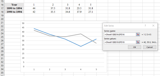
7). In the second row of the Edit Series box, which should have “={1}”, delete the one in that row. This row wants your Y values. Type “=” and use your mouse to select the numbers in the “1990 to 1994” row. Again, JUST the numbers, not the row title. Hit OK, and then OK again.
8). If necessary, you can add more data series by repeating this process.
Next, let’s add information to our graph. When you click your graph, a darker area on the toolbar called “Chart Tools” should appear, with “Design” and “Format” as subcategories. Click on “Design.”
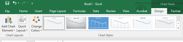
9). On the far left, click the Add Chart Element button. This will give a dropdown menu of a variety of graph elements.
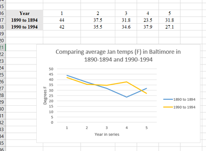
10). Add Primary Vertical and Primary Horizontal axis titles. They will add as “Axis Title” to your graph, and you can click on and edit them. Don’t forget units!
11). Add a Chart Title above the chart. Make it detailed and specific to this graph.
12). If you want to change the colors of your lines, you can highlight your graph line by clicking on it, and when you right click, it should offer “Fill” and “Outline” color options.
13). Under Add Chart Elements, also add a legend. You can pick the location of your legend. In the end your graph will look like this: