Chapter 1. Correlation
In the Basic Statistical Analysis Course (e.g., PUAD 628), we dealt with a single variable or univariate data. Another type of important statistical analysis problem is the problem of identifying the relationship between multiple variables. To do so, we need to turn to bivariate data. For instance, economists are often interested to understand the relationship between two variables as follows,
(1) Education and wages,
(2) Salaries and CEO performance, and
(3) Aid and economic growth
In these problems, we are interested in whether one variable increases accordingly to the other, and whether the relationship is very pronounced or to the extent that there is a trend. If this relationship is identified, it can be appropriately used for business strategy, investment strategy, economic policy, and educational policy establishment.
Correlation analysis and regression analysis are methods of analyzing the relationship between the two variables. Correlation analysis is interested in the degree to which the correlation between the two variables is clear. On the other hand, regression analysis is interested in deriving the relationship between the two variables into a specific equation. Accordingly, in correlation analysis, two variables are treated as two equal random variables, whereas in regression analysis, one of the two variables is regarded as an independent variable, so only the dependent variable is treated as a random variable.
In other words, under the perspective of correlation analysis, the levels of the variables are not under the control of the researcher because variables constitute random samples from the population. However, under the mentality of regression, one variable is clearly an outcome we want to predict or understand. In regression, a dependent variable is treated as a random variable, but independent variables (predictors) are treated as fixed variables (i.e., predictors constitute the only values of interest in the study so that the levels of the variables are under the control of the researcher).
These two analysis methods are used complementarily to identify the relationship between variables. In this chapter, we first look at correlation analysis, and then we look at regression analysis in the next chapter. To measure the association between two variables, a joint distribution is used as follows:
Here, an independent variable is located on the x-axis and the dependent variable is depicted on the y-axis. The independent variable is labeled  and is usually placed on the horizontal axis, while the other, dependent variable,
  , is mapped to the vertical axis. The height is seen as the frequency of observations (or cases).
The above joint distribution displays a normal distribution, and the normal distribution consists of three elements:
(1) Bell-shaped,
(2) Symmetric, and
(3) Unimodal.
1. Scatterplot
To explore relationships between two variables, we often employ a scatterplot, which plots two variables against one another.
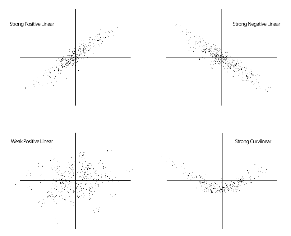
We typically begin depicting relationships between two variables (i.e., X-Y Relationship) using a scatterplot—a bivariate plot that depicts three key characteristics of the relationship between two variables.
(1) Strength: How closely related are the two variables? (Weak vs. strong)
(2) Direction: Which values of each variable are associated with the values of the other variable? (Positive vs. negative)
(3) Shape: What is the general structure of the relationship? (Linear vs. curvilinear or some other form)
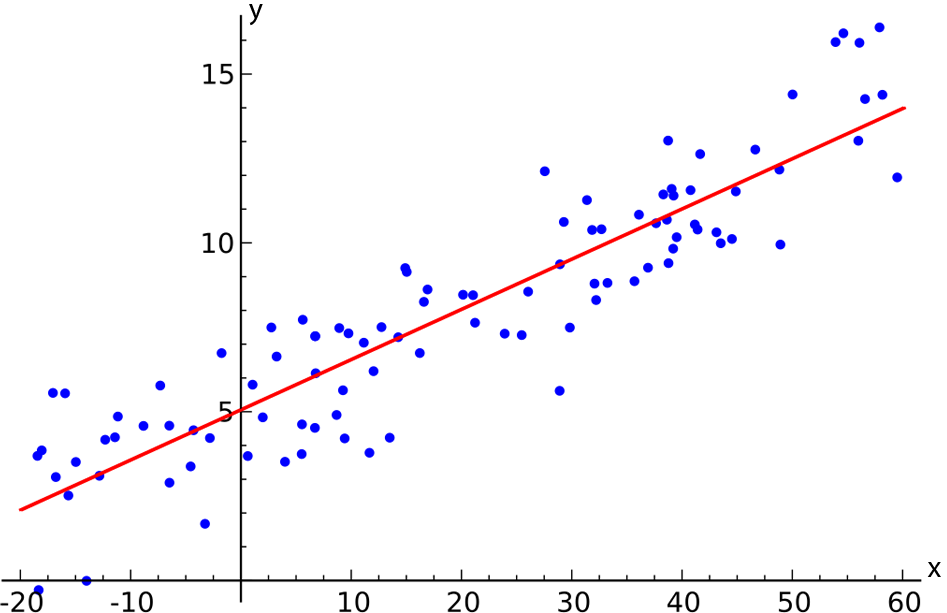
By convention, when we intend to use one variable as a predictor of the other variable (called the criterion or outcome variable), we put the predictor on the x-axis and the criterion or outcome on the y-axis.
When we want to show that a certain function (here, a line) can describe the relationship and that that function is useful as a predictor of the variable based on , we include a regression line—the line that best fits the observed data.
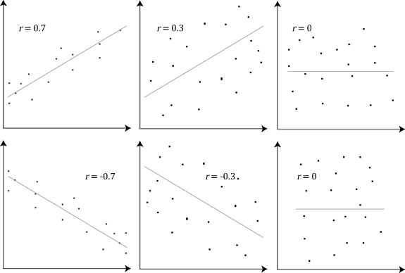
As is true for many other characteristics of distributions that we wish to describe, parameters and statistics describe the association between two variables. The most commonly used statistic is the Pearson Product Moment Correlation ( , which estimates a population parameter of
  — rho). The correlation coefficient captures the three aspects of the relationship depicted in the scatterplot.
(1) Strength: How closely related are the two variables? The absolute value of ranges from 1 (positive or negative) for a perfect relationship to 0 for no relationship at all.
(2) Direction: Which values of each variable are associated with the values of the other variable? A positive sign, or no sign, in front of indicates a positive relationship while a negative sign indicates a negative relationship.
(3) Shape: What is the general structure of the relationship? Correlation  always depicts the fit of the observed data to the best-fitting straight line.
Note that if a scatterplot does not show a linear relationship, we do not take it as a correlation because if a relationship is not linear. In other words, even though a statistical software program generates a numeric value for a correlation once you input data that represent two variables, it does not mean it is an actual correlation because it is not always linear between the two variables. If the actual relation is nonlinear, then the correlation value generated by the statistics tool should be nullified.
The magnitude of correlation is between -1 and +1. A no correlation represents  . Both -1 and +1 are the maximum correlation, whereas the signs are opposite. According to Cohen’s rules of thumbs, a small correlation ranges
  , a medium correlation is
  , and a large correlation is
  , respectively.
II. Covariance
An important concept relating to correlation is the covariance of two variables ( —note that the covariance is a measure of dispersion between and ). The covariance reflects that degree to which two variables vary together or covary. The equation for the covariance is very similar to the equation for the variance, only the covariance has two variables.
![\[ S_{XY} = \frac{{\Sigma}_{i=1}^{n}{(X_i - \overline{X})(Y_i - \overline{Y})}}{n-1}, \]](https://ubalt.pressbooks.pub/app/uploads/quicklatex/quicklatex.com-a1e967bdc244ea6c2343254c78654d91_l3.png "Rendered by QuickLaTeX.com")
where  is mean of
  ,
,  is mean of
  ,
,  is number of sample size, and individual is
  . Note the denominator is
  , not just . In general, when the covariance is a large, positive number, tends to be large when tends to be large (both are positive). When the covariance is a large, negative number, tends to be large and positive when tends to be large but negative. When the covariance is near zero, there is no clear pattern like this—positive values tend to be canceled by negative values of the product.
However, there is one problem with the covariance—it is in raw score units, so we cannot tell much about whether the covariance is indeed large enough to be important by looking at it. The solution to this problem is the same solution applied in the realm of comparing two means—we standardize the statistic by dividing by a measure of the spread of the relevant distributions. Thus, the correlation coefficient is defined as:
![\[ r_{XY} = \frac{s_{XY}}{{s_X}{s_Y}}, \]](https://ubalt.pressbooks.pub/app/uploads/quicklatex/quicklatex.com-af7ccce192101e341c6d7b6128ee0c2a_l3.png "Rendered by QuickLaTeX.com")
where  and
and  are standard deviations of the and scores and is the covariance. That is, correlation is standardized covariance.
Because cannot exceed  , the limit of
  is 1.00. Hence, one way to interpret is as a measure of the degree to which the covariance reaches its maximum possible value—when the two variables covary as much as they possibly could, the correlation coefficient equals 1.00. Note that we typically do not interpret as a proportion, however. Therefore, the correlation coefficient tells us the strength of the relationship between the two variables. If this relationship is strong, then we can use knowledge about the values of one variable to predict the values of the other variable.
Recall that the shape of the relationship being modeled by the correlation coefficient is linear. Hence, describes the degree to which a straight line describes the values of the variable across the range of values. If the absolute value of is close to 1, then the observed points all lie close to the best-fitting line. As a result, we can use the best-fitting line to predict what the values of the variable will be for any given value of . To make such a prediction, we obviously need to know how to create the best-fitting (i.e., regression) line.
III. Principles of Regression
Recall that the equation for a line takes the form  . However, it is common to use two symbols that are b’s with subscripts. I will use the notation
![\[ Y = {b_0} + {b_1}X \]](https://ubalt.pressbooks.pub/app/uploads/quicklatex/quicklatex.com-e5efe21e85566ee15dcffb8d7cac6f64_l3.png "Rendered by QuickLaTeX.com")
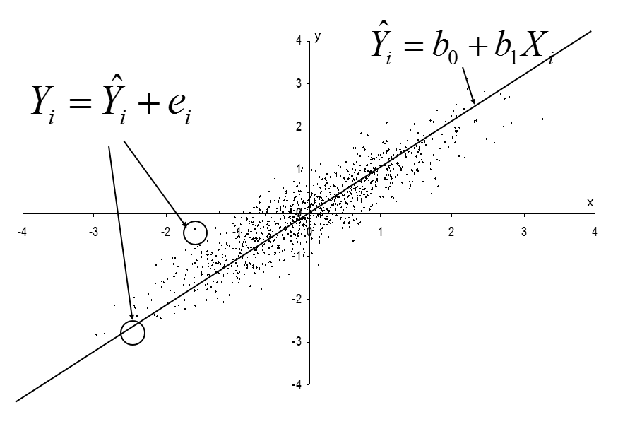
We need to show whether is an actual score or our estimate of a score. We will put a hat (^) over the to indicate that we are using the linear equation to estimate . Also, we subscript the and with to index the scores for the  case. The line is
![\[ \hat{Y}_i = b_0 + {b_1}{X_i} \]](https://ubalt.pressbooks.pub/app/uploads/quicklatex/quicklatex.com-13a6e41a23d12593337fb179fb28c8b7_l3.png "Rendered by QuickLaTeX.com")
This is called a “fitted or estimated regression line.” The components or parameters in the equation are defined as follows:
 is the value of predicted by the linear model for case .
 is the slope of the regression line (the change in associated with a one-unit difference in ).
 is the intercept (the value of when
  ).
).
is the value of the predictor variable for case .
There are several other versions of the model. The one above represents the predicted scores but we can also write the model in terms of the observed scores:
![\[ Y_i = b_0 + {b_1}{X_i} + e_i . \]](https://ubalt.pressbooks.pub/app/uploads/quicklatex/quicklatex.com-2422e3bcc6923b0ce96daab7cfebc58e_l3.png "Rendered by QuickLaTeX.com")
Note that we’ve added an error term  and now does not have a hat. This is also equivalent to the model showing the predicted score plus an error or residual:
![\[ Y_i = \hat{Y}_i + e_i . \]](https://ubalt.pressbooks.pub/app/uploads/quicklatex/quicklatex.com-076eb33fb027a10ae994ec231a75d047_l3.png "Rendered by QuickLaTeX.com")
Note that the first model is an equation for the line and the other two are equations for the points that fall around the line. Therefore, the equation for the line describes the points right along the line and the other equations describe the points:
We will have a variety of notations for regression and different books do not all use the same notation. I use the hat (^) over Y to indicate an estimated score of .
We also use the hat over Greek symbols such as  to indicate estimates of population parameters. One confusion we will need to deal with (later) concerns “beta weights” or “standardized coefficients” which some books denote using Greek letters even though they are sample estimates. I will call these
  .
.
Our task is to identify the values of and that produce the best-fitting linear function. That is, we use the observed data to identify the values of and that minimize the distances between the observed values () and the predicted values (). However, we can’t simply minimize the sum of differences between and (recall that  is the residual from the linear model) because any line that intersects
  on the coordinate plane will result in an average residual equal to 0.
To solve this problem, we take the same approach used in the computation of the variance—we find the values of and that minimize the squared residuals. This solution is called the (ordinary) least-squares solution (i.e., OLS regression).
Fortunately, the least-squares solution is simple to find, given statistics that you already know how to compute.
![\[ b_0 = \overline{Y} - {b_1}{\overline{X}} \]](https://ubalt.pressbooks.pub/app/uploads/quicklatex/quicklatex.com-8d4780384564db092a42e0f5434b7e91_l3.png "Rendered by QuickLaTeX.com")
![\[ b_1 = \frac{S_{XY}}{{S^2_X}} = r_{XY}{\frac{S_Y}{S_X}} \]](https://ubalt.pressbooks.pub/app/uploads/quicklatex/quicklatex.com-cedbf1076715240f1c049bedfdadafeb_l3.png "Rendered by QuickLaTeX.com")
These values minimize  , the sum of the squared residuals.
[Exercise 1]
As an exercise example, consider the data below. We are interested in determining whether wages  would be useful in predicting first-quarter productivity
  for factory workers. So, we decide the wages for a group of workers, allow all of them to work, and then obtain each worker’s productivity after one-quarter of work. We get the following descriptive statistics.
![\[ \overline{X} = 500 \]](https://ubalt.pressbooks.pub/app/uploads/quicklatex/quicklatex.com-bdd7faba7f0da92c22903245fe8237c5_l3.png "Rendered by QuickLaTeX.com")
![\[ \overline{Y} = 2.5 \]](https://ubalt.pressbooks.pub/app/uploads/quicklatex/quicklatex.com-4f95e5127aa0ad8726ab444aed4e96db_l3.png "Rendered by QuickLaTeX.com")
![\[ s_X = 100 \]](https://ubalt.pressbooks.pub/app/uploads/quicklatex/quicklatex.com-74a7772a0b30c7bb6e3b599cbfd04305_l3.png "Rendered by QuickLaTeX.com")
![\[ s_Y = .70 \]](https://ubalt.pressbooks.pub/app/uploads/quicklatex/quicklatex.com-3bb046f8f808397e431eedb3d533d95b_l3.png "Rendered by QuickLaTeX.com")
![\[ r_{xy} = .65 \]](https://ubalt.pressbooks.pub/app/uploads/quicklatex/quicklatex.com-44fd9685cb6e77a04effc3ec0b38b9f7_l3.png "Rendered by QuickLaTeX.com")
Based on the given conditions, provide the estimated regression equation.
Let’s plot that regression line (i.e., a statistics software program will plot this line for you if you have raw data). The line will always pass through the point ( ) which is (500, 2.5) for our data.
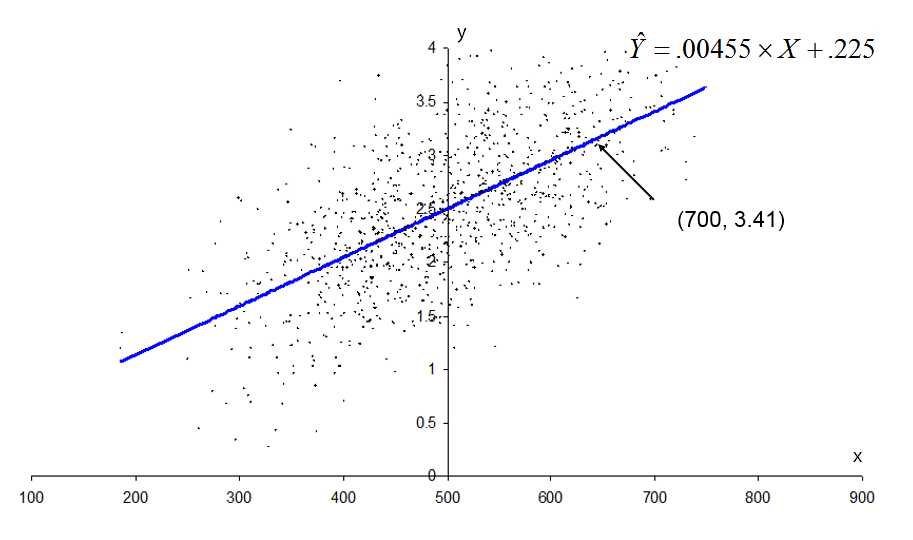
We may compute for another value (say, 700) to get a second point on the line:
![\[ \hat{Y}_i = .00455(700) + .225 = 3.41 \]](https://ubalt.pressbooks.pub/app/uploads/quicklatex/quicklatex.com-4a1a2c29f9ba5a58d0bf7d5eedb88565_l3.png "Rendered by QuickLaTeX.com")
Therefore, what do this regression line and its parameters tell us?
The intercept tells us that the best guess at productivity when wages = 0 equals .225—a situation that is conceptually impossible because wages cannot be as low as zero. This points out an important point, sometimes the model will predict impossible values.
What is for  ?
?
The slope tells us that, for every 1-point increase in wages, we get an increase in productivity of .00455. The covariance and correlation (as well as the slope) tell us that the relationship between wages and productivity is positive. That is, productivity tends to increase when wages increase.
Note, however, that it is incorrect to ascribe a causal relationship between wages and productivity in this context. There are several other conditions that need to be met in order to confidently state that interventions that change wages will also change productivity. Do you know what those are?
We will now spend the next two months or so learning all of the steps in regression analysis. This is where we are headed, but there are many pieces of this process to learn. Today we saw how to “estimate model” for one (one independent variable).
(1) Preliminary analyses
-
-
- Inspect scatterplots.
- Conduct case analysis.
- If no problems, continue with regression analyses.
-
(2) Regression analyses
-
-
- Estimate model.
- Check possible violations of assumptions for this model.
- Test overall relationship.
- If the overall relationship is significant, continue with the description of the effects of independent variable (IV)’s (or if not, try other models).
- For each interval and dichotomous IV, test coefficient, compute interval, assess the importance, and compute a unique contribution to
 .
. - For each categorical IV, test global effect and, if significant, follow up with test, interval, and assessment of importance for each comparison.
- If the equation will be used for prediction, assess the precision of prediction.
-
Sources: Modified from the class notes of Salih Binici (2012) and Russell G. Almond (2012).
